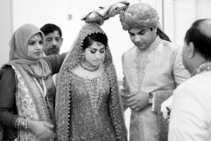
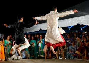
I’ve been a fan of Syed Yaqeen’s for a while. He has a knack for capturing some of the most dramatic lighting I’ve seen and his portfolio is filled with a broad array of cultures and traditions.

It didn’t hurt to learn that the guy snagged one of the greatest domains a photographer could ever want – NewYorkCityWeddingPhotographer.com. What a smart guy!
Syed’s the kind of professional you want in your circle, which is why I asked him to join my Luxury Wedding mastermind, The Gathering. He’s been an invaluable resource and a great friend.
What a surprise!
You can imagine how excited I was when he mentioned it was time for a brand refresh.
I know, it’s a nebulous word. Not only does it mean different things to different people, it can mean different things to the same person on any given day.
Syed had a beautiful brand already.
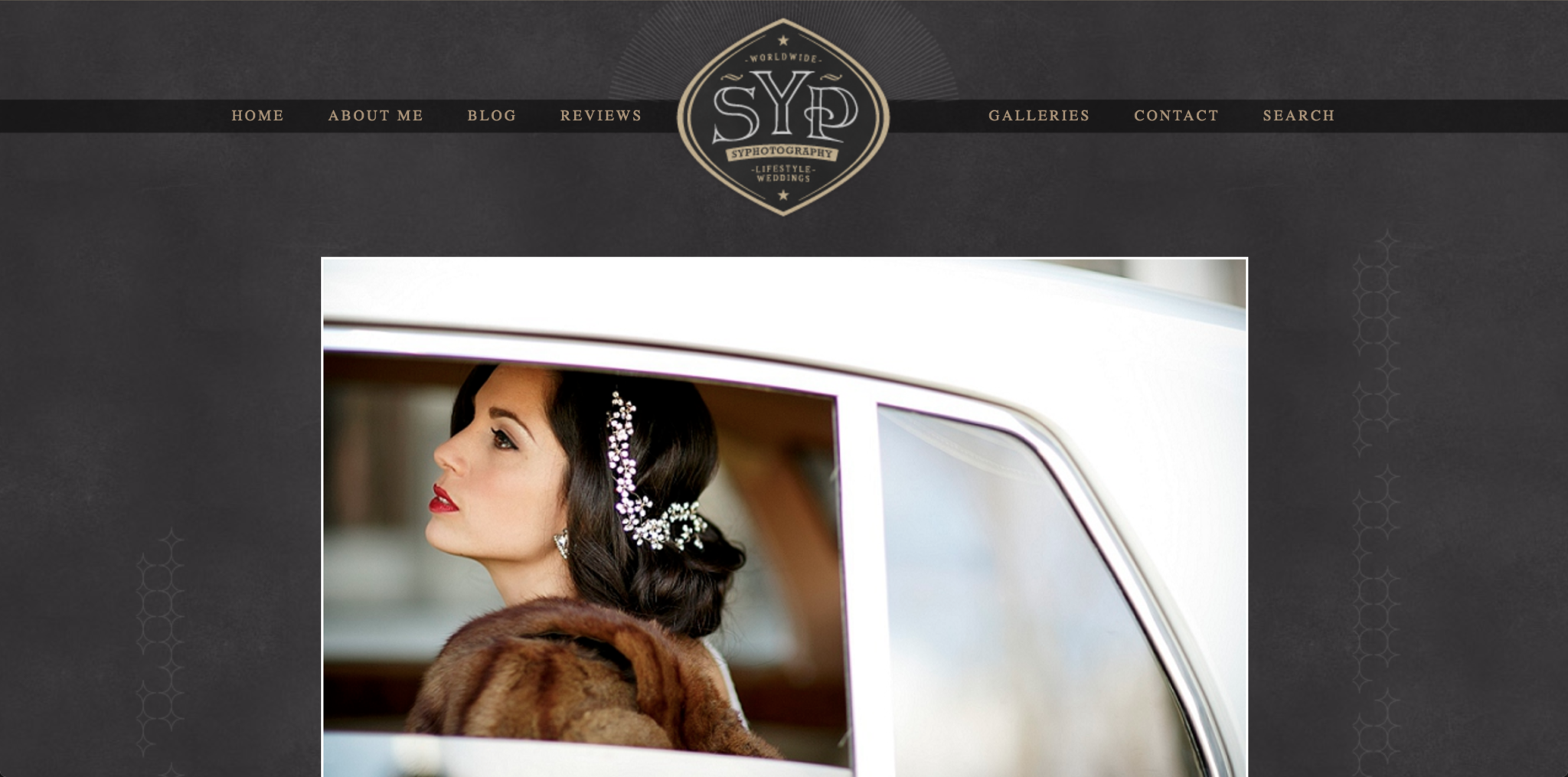
It was playful, but sophisticated.
For Syed, the colors were right, so the focus was a clean, new logo in the same colors.
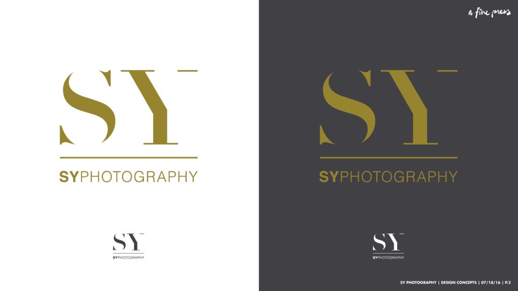
The process
Over the years, my approach to logo design has evolved quite a bit (and it still is). My current approach is based on what I learned from one of my design mentors, Aaron Draplin. After a great conversation about Syed’s goals, his clients, and his positioning in the industry (designer-types call this discovery), I went back to my corner and sketched what was at least a hundred thumbnail concepts for a logomark and at least half that in variations of the text “SY Photography.”
With Syed’s goals at the fore, I narrowed these down and created rough digital versions of several of them. I send these as a PDF, with the logomarks and type separate, followed by a few “lockup” concepts.

click this to see what it looks like
This gives us a foundation for the next conversation – what each possibility communicates and how it lines up with the story Syed’s trying to tell.
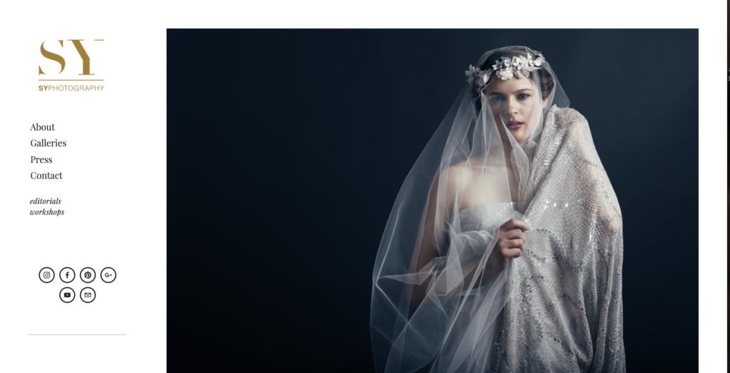
From there, we narrowed it down to two logomarks and a couple variations of the text. Honestly, I was initially surprised with Syed’s choices, but I think he’s spot on, especially now, since the launch of his new website.
(keep reading for the link)
After refining the final two, it became clear exactly which direction to go. From there, I built out both gold and graphite versions of the logo in various formats as well as social media icons and a favicon.
I’m proud of the outcome and Syed is, too. It was a wonderful collaboration and I’m looking forward to working with Syed again soon.
Click the images below to see Syed’s new website.