Color is something that is often carefully planned for, but executed without much scrutiny. Whether you’re planning a wedding, fundraiser or brand strategy, it’s likely that someone (you, your wedding planner, your marketing/branding firm…) put a lot of time into color selection. It’s important that you spend as much attention on the execution of color in your printed materials.
If you’re a child of the internet age, there’s a decent chance you know about HEX and RGB colors. If you’ve ever worked with a color copier, you might know about CMYK, too. These are various ways to define a color by the mixture of colors that make it up (Red, Green and Blue or Cyan, Magenta, Yellow and Black). The challenge is this: that perfect shade of green that you saw on a website (HEX) might not be so rich on a brochure (CMYK). What’s worse, that same green will probably look different on my monitor than it does on yours. Even from one inkjet printer to the next (and on digital presses/copiers, color can be inconsistent.
Enter the Pantone Matching System (PMS)
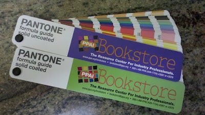
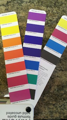
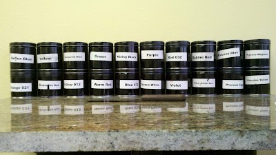
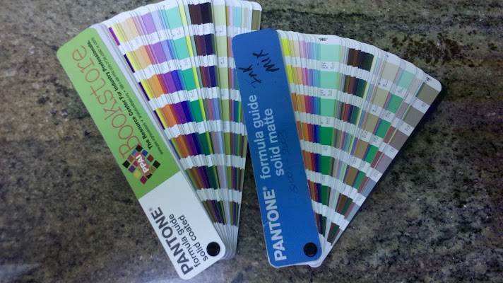
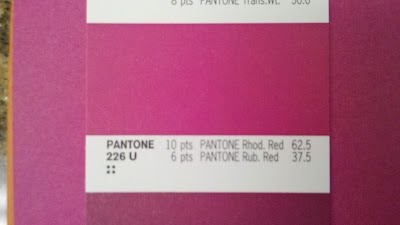
The Pantone Matching System creates a common reference and language when talking about color. Pantone produces color-matching guides, paints, plastics and more and licenses it’s system to ink makers who make the 15 base colors (13+white and black) that allow printers to produce any of Pantone’s 1,114 spot colors (as opposed to mixed colors).
The Formula Guide
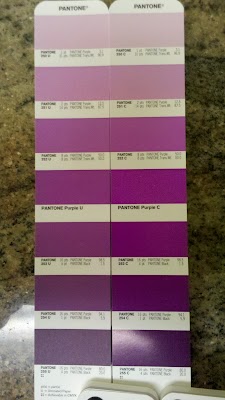
Every wedding planner, florist and event designer should own at least one of the Pantone formula guides. The basic guide comes in three varieties: Coated, Uncoated and Matte. These refer to the types of paper used for the guides and should match the type of paper being printed on (there’s a nice discussion of paper and the difference between coated and uncoated here). As you can see below, the same Pantone color (referred to by its number – PMS 250 through PMS 255 in this case) is much darker on the coated stock than the uncoated stock. These are considerations your printer can accommodate for, but something you should know to communicate when matching colors on your end.
Pantone suggests you replace your guide each year. While it may seem like a ploy to keep you buying more of their product, there is truth to the fact that the colors fade and may no longer represent the standard they were printed to represent. Even more, there are often updates to the guides, like making them bigger and moving colors away from the binding post so they’re more usable.
Speaking of matching colors
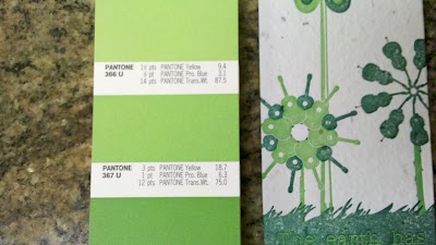
With a Pantone Formula Guide, you can confidently communicate with designers and printers about the color you’d like to see on your final product. Below, I’ve matched a commercially available paper to its nearest Pantone match – PMS 266 U (“U” for uncoated). The same can be done with fabric swatches, furniture, wall colors and even florals. Of course, there is likely (or, in the case of florals, definitely) variation in your reference material. This is OK. In these cases, a PMS color to communicate is much better than “a yellowish green with a hint of red.”
PMS and letterpress
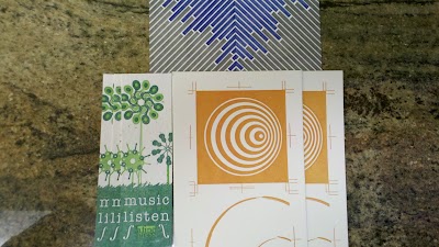
Letterpress printing can present some unique challenges to application of the Pantone Matching System. Most letterpress business cards and invitations you see are printed on uncoated stock. This means if your’re a wedding planner working primarily with high-end brides, the uncoated guide is going to be a steady companion for you. Aside from the deep impression that distinguishes letterpress printing from everything else, one of its greatest draws is the rustic, hand-made feel that comes from translucent inks and “saltiness.” Translucent inks mean that the color of the paper effects the final color of the printed area. Saltiness is the (usually desirable) characteristic of the paper’s texture and color appearing as a sort of salty dusting of white (or whatever the paper’s color) through the image. If you’re asking for letterpress printing, these traits are probably desirable to you, but it’s worth noting that the characteristics of a PMS color on a letterpress business card will not be the same as if it were printed by an offset commercial printing press.
In addition to the influence of paper on color, the means of inking the forme (yeah, it’s really spelled like that) may cause fading along the print run. Not all presses transfer ink the same way; some include constant-inking systems or ink fountains that maintain a consistent amount of ink on the printed surface. Without these, there is some variation. If you cannot live without variation like that shown below, let your printer/designer know. Some may accommodate you (perhaps for an additional charge) and some may recommend another option.
So get a guide already!
If you’re a wedding coordinator, event designer, or other visually-oriented event professional, do your clients a favor and buy a set of Pantone Formula Guides. If you’re planning an event (or wedding) and your planner doesn’t have a book, don’t fret. You can visit a local commercial print shop and ask for help in matching a color. Ink manufacturers often innundate print shops with formula guides. If you’re matching to a fabric swatch or similar, you can send that physical object to your designer to match. A picture won’t do – remember that bit about monitors showing color differently?
If you’d like to purchase the coated/uncoated Pantone set (they don’t sell either individually), feel free to purchase it through the following link, which is an Amazon Associate deal (I’d get a small cut).

