I’m absolutely loving the trend of combining full-color (and greyscale) images with spot-color printing like letterpress, foil stamping and screenprinting. It can create serious drama in an invitation or even business stationery. This is especially true when the photographic components are strong editorial-style images (which I’m delighted to see rising in popularity) or luxurious fields of texture (think watercolor, feathers and florals…).
There are a couple things to consider when combining processes that will help give your stationery as much impact as possible:
Register
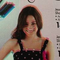
In printing, register refers to the alignment of the processes a piece of paper goes through – the inks, foils, and diecuts a piece of paper are subjected to all need to line up. It’s the little crosshairs that were on your Delia’s catalog that kept the models’ faces from looking like this.
While it’s not always an issue, sometimes using different printing methods may make it impossible to perfectly register, say, foil to digital. But not to worry! The best way to deal with this is to ensure your design doesn’t have any VERY tight register requirements. That would be things like super thin lines of foil that have to perfectly outline 8 point text. That’s just silly design anyway.
But this is the reason why many of the combination designs you see available from pre-designed shops are things like champagne bubbles printed in foil or simple geometric patterns in letterpress. Those things don’t have to line up perfectly with the image behind them.
Digital or Offset
This is a big one for me. This isn’t the place for a primer on the difference between the two (this one should suffice). The important thing is this: until recently, there were no digital printers that could handle the type of papers common in letterpress and foil stamped invitations. Things like Crane Lettra 110 and 220 pound paper or the Wild 166 pound paper used in our Humble Beginnings collection of wedding invitations. Those papers were simply too thick for digital presses.
Now there’s the HP Indigo, which can handle some thicker, cottony papers that are suitable for letterpress invitations. I was curious as to the quality of these and ordered a sample pack from one of the major on-demand digital print shops (we don’t do nearly enough digital printing to warrant bringing one in-house) and the results I received were pretty disheartening.
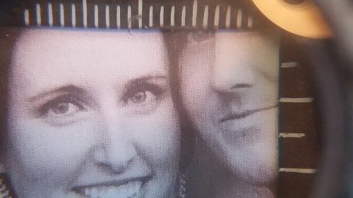
We know that process-printed images (like digital and offset) are made using halftones – grey isn’t really grey, but tiny dots of black with white in between. The brain sees the combination of black and white and averages it out to grey. The density of those dots determines how grey that part of the image is.
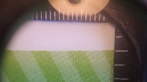
The halftones here were clearly visible with the naked eye and WAY worse when magnified.
Even the solid areas of color were poorly produced. It was disappointing all-around.
Here’s my recommendation – if you’re looking to add letterpress, consider having the image portion printed offset. In fact, on a recent project, even a run of 100 pieces (very small for offset) was significantly cheaper than letterpress – on the same premium papers we print letterpress on. It may be more affordable than you think and will give you a much better result.
If you’re looking to foil stamp, consider printing your image as a photo (through a photo lab on photo paper). It will give you the best color image and most will take foil well (make sure to run a test first!). It can then be duplexed to anything you want, making it thicker and more luxurious (sounds like a shampoo commercial).
With a little consideration, combining printing techniques can produce stationery with serious impact. Just ask questions and plan ahead.
[hr align=”center”]
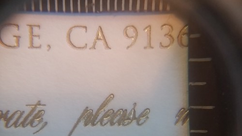
As a small postscript, the company I ordered samples from was disappointing all-around. This was an example of the foil-stamping work they sent as an example of their best work!
Yikes!


