Not long after I started promoting Wild 166# paper as an excellent choice for business cards and the Humble Beginnings collection, my primary supplier completely ran out. Ain’t that a kick in the head?
I finally found another supplier and got
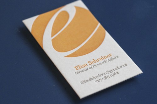
Elise is a talented photographer who happens to be taking a sabbatical. Like most photographers, she’s used to having a card to hand out when she meets someone new and didn’t want to go without just because of her sabbatical. We used the logo from her photography brand and gave her the title “Director of Domestic Affairs” (how cool is that?!). The large areas of color and whitespace in her logo made for a nice sculptural feel.
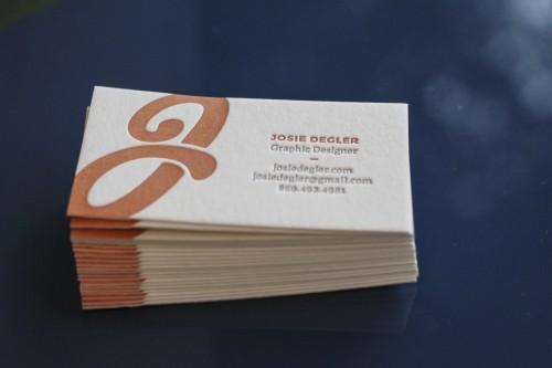
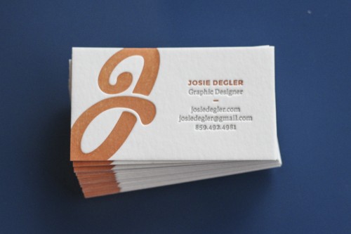
Josie’s a graphic design student at the University of Louisville (home of the Aebersold Jazz Camps if you were wondering). Being a graphic designer, she was set with this strong, bold design that looks great in letterpress. Right off the press, the orange in these cards was a little too light, so I ran it through the press a second time to give it a little more oomph. I love the way the script “J” bleeds off the edge of the card on these!
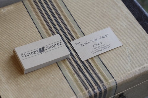
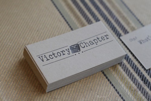
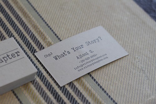
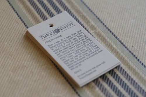
Ajioni is on a mission. His story (shared on the hang tag here) is a powerful story of overcoming adversity and he’s intent on helping others do the same. Ajioni needed business cards and a hangtag for his retail clothing line. We printed both in black on French 140# Kraft paper. Two-sided letterpress printing is always an exercise in compromise; the impression of one side will knock out the impression on the other. In this case, aligning the elements so there was minimal overlap from one side to the other allowed for a nice impression on both sides without punching through the other side.
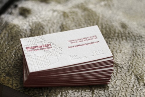
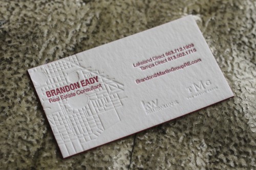
This might be my favorite business card project ever. My friend, realtor Brandon Eady, wanted a business card that’s out of the ordinary for his industry. Honestly, I think most real estate business cards are horrible. Who ever decided a mediocre headshot was a necessary design element for these things?
Instead, we elected to print a blind impression (no ink) map of downtown Lakeland, Florida. It’s my hometown (my neighborhood, even! You can see where I live on this business card) and it’s Brandon’s geographical area of focus.We thought it would be a cool way to express what Brandon does and where he does it. Then we hit the details in Keller Williams’ red and lined the edges in the same color.
Not a bad week if you ask me!

