
Being a part of a close-knit group of entrepreneurs, tech employees and creatives in a coworking space comes with daily challenges and often unexpected rewards. Most of them are the kinds of things you’d expect – moments of serendipity contrasted with times of significant distraction. It was in one of those moments of serendipity that a group of Catapult members were brought together to assist AgAmerica in the honing of their brand.
AgAmerica is the lending arm of a family of businesses that encompass the spirit and experience of agricultural land-ownership. Its sister companies – under the umbrella of The Land South Group – cover everything from property management and development to high dollar land transactions and cell tower negotiations (isn’t infrastructure fascinating‽).
AgAmerica has positioned itself as Innovators. Educators. Land Lenders. with an eye very much towards the future while still honoring the legacy of the industry it serves.
As a part of the process of clarifying their market position, the leadership of AgAmerica asked me to develop and produce business cards for each of their employees across several companies.
The Challenges
- The use case for business cards varies greatly among AgAmerica/LandSouth employees. Some employees are rarely outward-facing and have minimal need for business cards, much less premium cards. Other staff members are often engaged in high-level meetings with potential clients or partners where strong positive impressions are often a major factor in the outcome.
- While AgAmerica is very much a forward-thinking company, it operates in a space of men and women who spend much of their day, literally, in the field. They needed stationery that would represent them well in a boardroom in New York City and yet not feel out of place in the hands of a farm owner.
- While the LandSouth family of logos all had clear and direct 1-color options, the AgAmerica logo incorporated a screened American Flag in its logomark that could not be reduced without greatly reducing its impact. This meant reproducing it in letterpress or foil (two of the most direct ways to say “high-level”) would be very costly. Not impossible, but 4-color letterpress isn’t always the best option.
- While were were dealing with a pretty high volume of cards overall (several thousand), each lot (individual card design) only required 100-200 cards, playing at the disadvantageous end of the economy of scale.
- Several staff members made it clear that their use of business cards revolved pretty heavily around their ability to write notes on them – something I firmly believe in. And anything that impeded that would be considered a flaw.
- Large orders of corporate business cards mean I don’t get to hand the user their cards in person. It also means they weren’t neccesarilly involved in the decision-making process; this can feel like a handicap when it comes time to deliver the cards.
The Approach
It was clear from the start that an approach that included “standard” and “premium” or “C-level” cards would be the best approach for AgAmerica. Not only would this save the client money, it would also provide a more appropriate look and feel for each staff member’s business card. This is an approach that doesn’t work for every company; sometimes politics and hurt feelings will preclude this option. In this case, the people who would be getting standard cards understood the nature of the beast – the way they used their business cards (on the rare occasion) was vastly different than that of am VP or Fund Manager.
We knew we wanted to build a cohesive system that made each card feel like a part of a whole while conveying the unique message of each use. One of the uniting factors of all of the companies is the use of their Oak Tree mark – it’s present in each of the logos and is a symbol of the stability and longevity this young-minded company brings to the table.
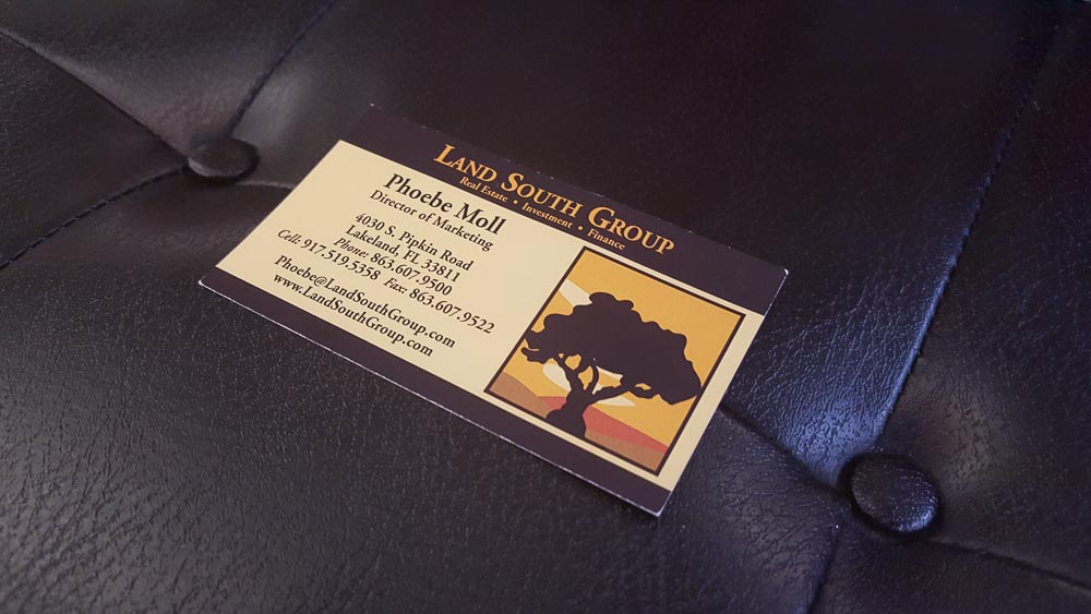
The original Land South Group card – what we were replacing.
An early solution was to diecut all cards in a way that highlighted the tree silhouette. A left-side diecut on the logo-side of the card would make a sizable grip area for a right-handed person holding the card to read the contact details (it really is good habit to actually read the card when someone hands it to you). This also allowed us to create a card that fit in standard-sized cardholders and rolodexes (remember, we are dealing with a primarily agricultural audience) while presenting a more modern, slim profile that’s been widely popular since Moo introduced the slim card to the masses.
An early mockup of the diecut card.
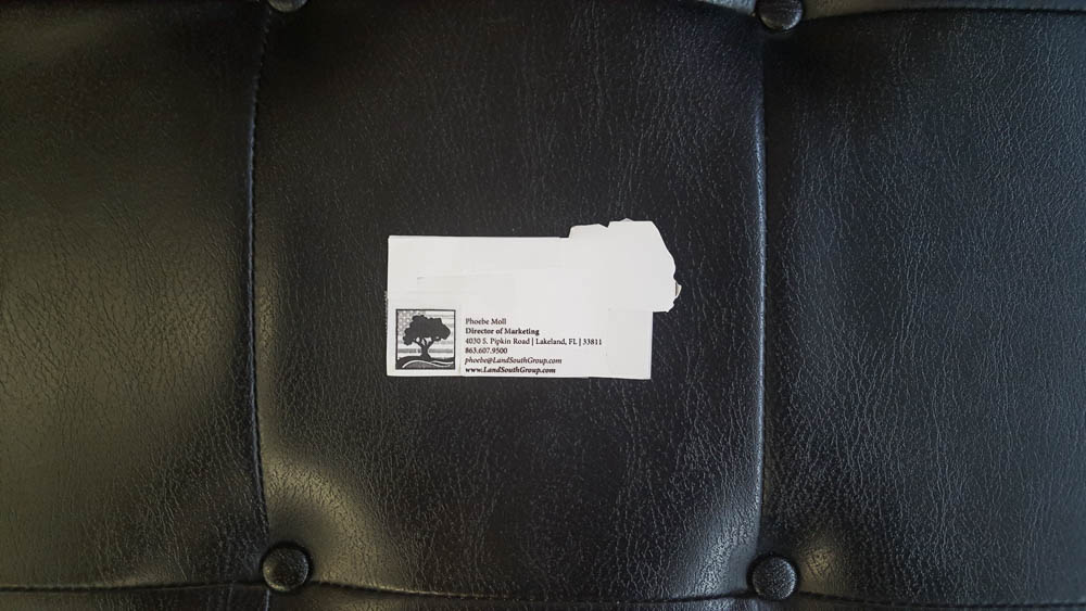
While this solution worked across most of our challenges, in the end it wound up being too much of a compromise in terms of usable space for writing. One of the main culprits was the need to express the AgAmerica logo on the information-side since it wasn’t directly stated on the reverse. There was also a concern that the slim, diecut card was just a hair too modern for the target audience.
While we were considering the layout of the card, we were also looking at what substrates and printing methods would best convey the AgAmerica brand. To provide the best canvas for the AgAmerica logo and to set them apart from the majority of the market, I wanted to stick with a bright white. I’m a big fan of Classic Crest and their solar white was a perfect fit. Their 130# DTC (it stands for double-thick cover, but the truth is it’s only meaningful if you also know the caliper (thickness) of the paper) made the perfect base for our standard cards and would serve as one side of our C-level cards.
As the concept evolved, it became clear to the client that all of the AgAmerica cards and all of the LandSouth Group cards needed to be C-level. We were on the verge of making something really special and it didn’t make sense to reserve them for only a few, as there were so few people in these parts of the organization that weren’t frontline, outward-facing. This left us with the need for three basic designs across the companies: a C-level card for The LandSouth Group, a C-level card for AgAmerica, and a standard card for the rest of the companies under the umbrella. A few employees would need cards for both LandSouth and AgAmerica, too.
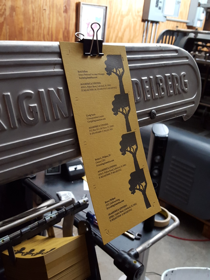
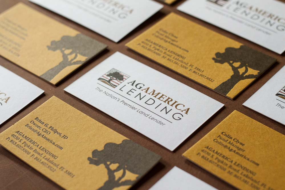
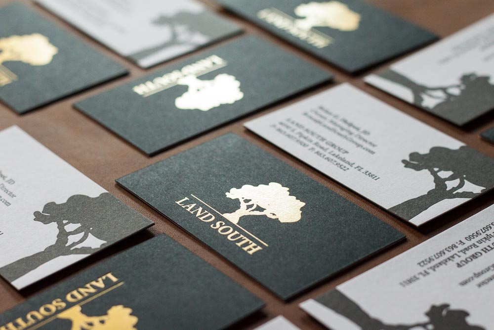
So, what for the other side of our duplexed C-level cards? Now that we had a clear delineation of card types, we could focus on a look that spoke most clearly to each business’ target audience. For The LandSouth Group, a matte gold-on-black look duplexed to a black and white back would give us the heft, rigidity and look that spoke to the financial industry side of the business. It was in the AgAmerica card that we had a real stroke of geniusluck. Of all the papers in all the world, I found one that represented the AgAmerica brand better than we could have dreamed for – Reich paper makes a line called Aveo from the refuse of processing sugar cane. It just so happens that one of the two shades the make it in is a perfect match for the primary brand color in AgAmerica’s visual identity. I couldn’t believe how perfect this was!
So, for the AgAmerica card, we focused on using the same layout as The LandSouth Group cards but creating an identity and feel that was thoroughly Agricultural. So the details of the AgAmerica logo were letterpress printed in the Aveo paper and duplexed to a 4-color offset print of the AgAmerica logo on Classic Crest Solar White.
Since AgAmerica had engaged my fellow members at Catapult to help with their overall visual identity, we had a great style guide to work with. That made laying out the business cards a simple endeavor. We wanted as little text to tell the bearer as much as possible. The only variation was the inclusion of a small logo on the information side of the 1-sided standard business cards
Production
Once we settled on the materials, methods, and layout of the cards, there were only a few decisions left to make before starting production.
The Standard Cards
These were simple – from a well-crafted spreadsheet created by the client, I was able to merge each employee’s information into the card layout in Adobe InDesign. I handed those off to my offset pressman and was handed back beautiful finished cards.
The LandSouth Group Cards
For both The LandSouth Group and AgAmerica, The goal was to gang-up as efficiently as possible – that means running the appropriate amount of cards per press sheet. The more cards per sheet, the less labor is involved. But there’s diminishing returns in the quality of the print. I typically print business cards 2-up on a 4.5×5.5 sheet. This leaves me between ¼” and ½” margin on all sides.
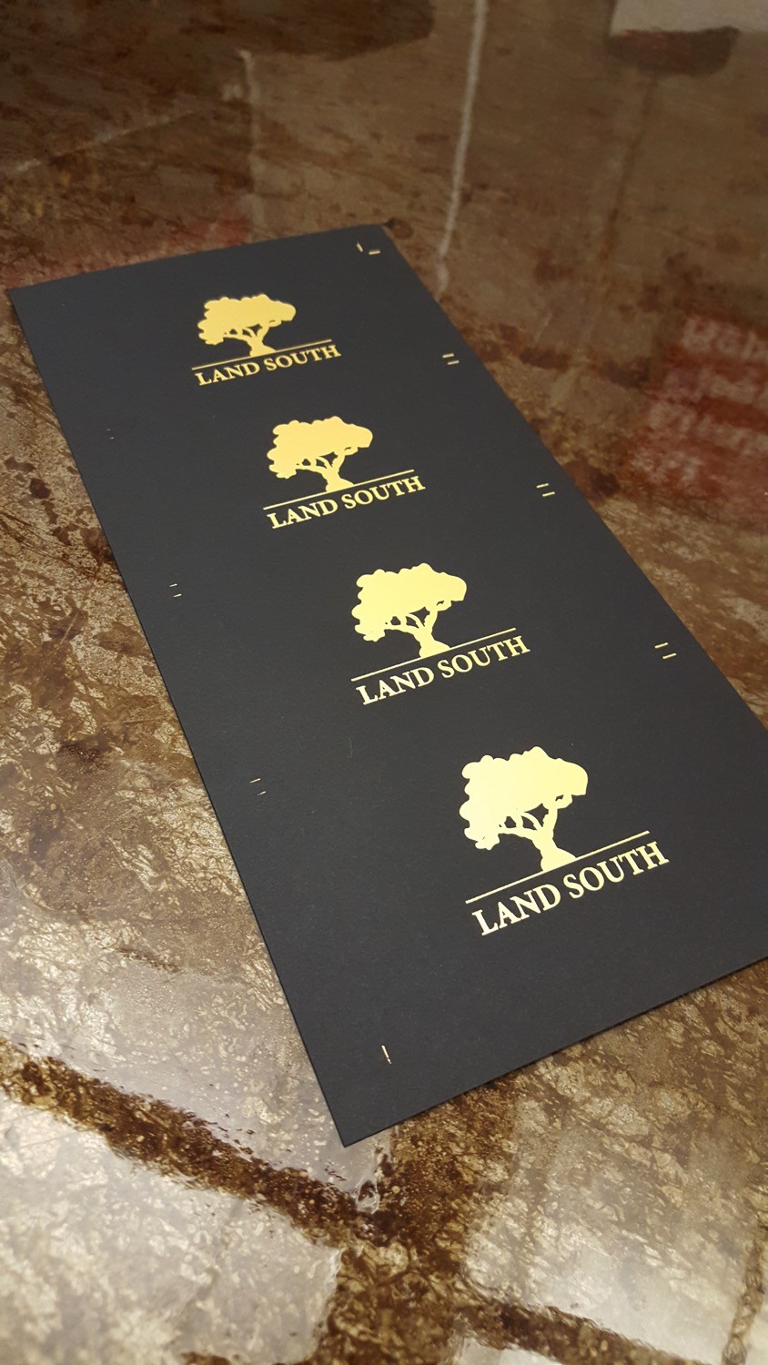
For these cards, I chose to run them 4-up in a strip 9.5” long and 4.5” wide. This not only made printing more efficient, but it also aided in maintaining register on the duplexed sheets (the longer sheet minimized the effect of minor rotation of the sheet on press). I had a die of The LandSouth Group logo made 4-up with an ⅛” gutter between the two – that left only 1/16” bleed above and below each card. Since this was simply a centered logo, it wasn’t an issue on this side, but definitely made the other side challenging. I printed a matte gold foil on Classic Crest Epic Black on my Heidelberg Windmill.
The reverse was printed with photopolymer in Deep black on the Classic Crest Solar White. The challenge there was inking the forme in a way that kept the black of the tree strong without the ink of the text spreading too much. Classic Crest is a dense paper (and not as thick as many letterpress papers. This means there’s not a lot of room to compress the paper with the letterpress forme. So using a softer packing (the paper placed on the press behind the printed sheet to build it up to the right height) allowed me to actually push the paper and displace it instead of simply compressing it. There’s only so much of that you can do, though, without causing damage to the paper.
The AgAmerica Cards
The detail side of the AgAmerica cards was printed in the same manner as The LandSouth Group cards, except on the Aveo sugar cane paper. The softer paper meant we could squeeze a little more impression out of these cards.
The reverse was offset printed like the standard cards in 4-color with the AgAmerica logo centered on the sheet in all its glory.
Duplexing
Most shops use a Potdevin gluing machine to apply a film of glue to a sheet in order to duplex substrates. I prefer screenprinting the glue, as it allows me to control where it’s applied and gives me a glue-free margin on the paper where I can handle it without making a mess. I apply glue to one side and line the reverse up to it (making sure their tops align) and place it under weight overnight to dry.
Most of my projects are cut on a smaller electric cutter. On larger jobs like this, I prefer a larger hydraulic cutter with a programmable backguage. this allows me to consistently produce 2×3.5” cards, cutting an entire lift (stack) all the way from beginning to end. With the electric cutter, the such accuracy requires cutting the first cut through all of the lifts (in this case, dozens) and then progressing to cut 2, etc. At higher quantities, this not only takes an exorbitant amount of time – it also leads to errors.
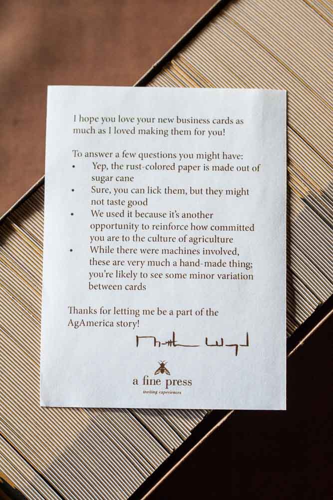
Once everything was printed, duplexed and cut, the cards were boxed and hand-delivered (I love when I get the opportunity to do that). I included in the AgAmerica a little note with some frequently asked questions – I heard through the grapevine that there was quite a bit of excitement over these cards in the office. It was a way to communicate some key points directly to the card’s owner, since I wasn’t able to do so during the design process.
One of the takeaways that is the same for every client is the handmade nature of the work – while my client (the advertising agency, marketing director, etc) has heard this multiple times from me, the end user likely hasn’t. It’s a way to remind them not to look for a robot-like consistency and to be able to appreciate the minute variations that make this stuff special. It’s a reminder that my hand was involved in the making of their cards from beginning to end.
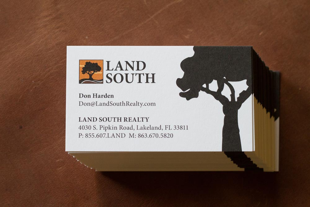
The standard LandSouth card.
Conclusion
Now, AgAmerica and The LandSouth Group have business cards that have their culture and purpose embedded in them. They’re the perfect cap to an important meeting, a totem by which to remember its owner and the company she represents.
I was thrilled to know that AgAmerica had ordered bison leather card holders for their employees to brandish their fancy new cards in – an appropriate companion to my work.
0 Comments