I have to admit: I’ve been a little obsessed with Making It on NBC.
It could be my love affair with Parks and Recreation.
It could be my mancrush on Jimmy DiResta (Nick Offerman’s not so bad, either).
I won’t spoil it for you here, don’t worry, but one of the things that thrilled me was the inclusion of Simon Doonan as a judge. Simon works in what I believe to be about the highest form of commercial art+craft there is – the store window. Simon’s work ar Barney’s is absolutely iconic and should be an inspiration to every person in the event industry.
It was a similarly iconic window – that of Bergdorf Goodman – that brought me to the work of Benjamin Shine.
This work is just so dreamy!
It reminds me in some ways of Vik Muniz in his use of largely unaltered “common” materials to create images that go way beyond the “if I squint, I can see it.” These are stunning representations of people (mostly) crafted in the most unconventional ways.
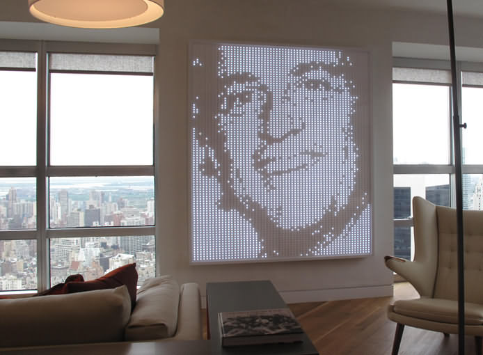
Take, for instance, this pill-pack portrait:

photo by the artist
I’ll give you ten guesses what it’s made of.

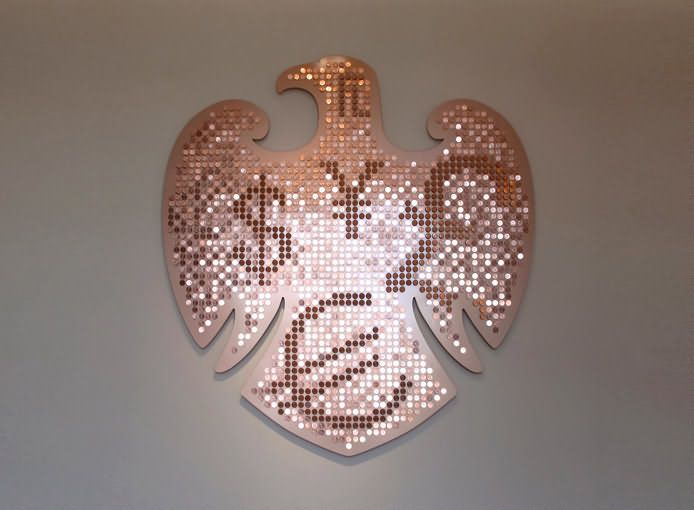
another photo by the artist
This one is incredible to me for the way he gets those colors – it’s the angle at which the pennies are mounted that uses the ambient light to illuminate and camouflage different areas of the crest.
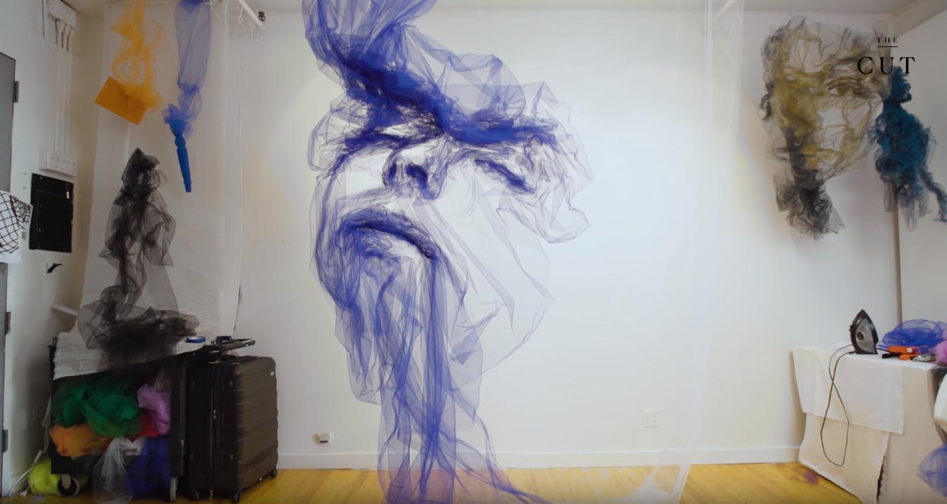
But it’s certainly those stunning tulle works that do it for me.
I’m fascinated by the story, the process, and the execution. It’s all so entrancing.
I wish more designers and marketers and event professionals paid deep attention to people like Benjamin and the work he’s doing.
This work is engaging an experiential and just ripe for these professionals to turn into head-turning, attention-garnering work for their clients.
What would you do with techniques like these?

0 Comments