I’m thrilled to share the first of several pieces representing the new brand identity I’m doing for my favorite lifestyle company, The Poor Porker.
Owners Jarrid Masse and Robyn Wilson trekked across the United States from LA to Lakeland, Florida to open a beignet stand at the local farmers market less than a year ago.
While there are plenty of locals that only know Robyn and Jarrid by their delicious beignets, people across the country know The Poor Porker for their brilliant DIY ethic and impeccable style. Having garnered national exposure for their work and style within only a few months of swinging open their weathered shutters, The Poor Porker is about to become a household name with some ridiculously exciting things in the works!
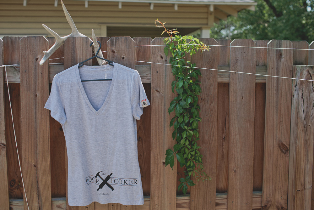
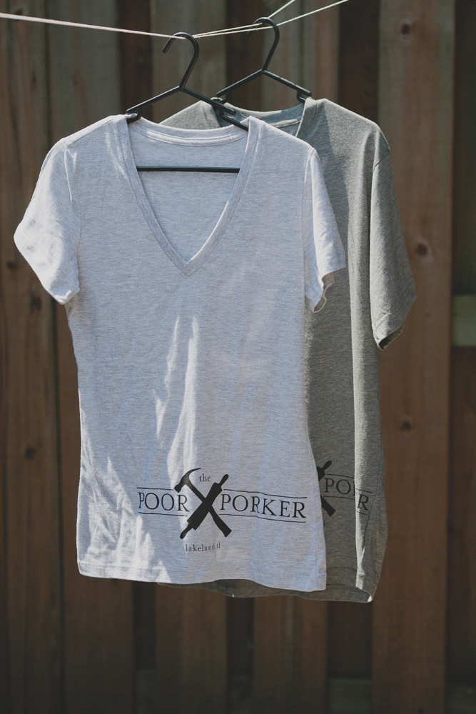
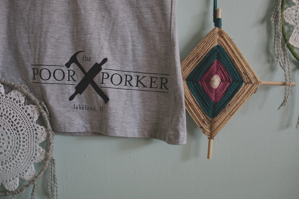
The beignets are important, but they’re not the only facet. After much trial and error, we (along with co-conspirators Penny & Finn) all agreed that the hammer and rolling pin would become the totems of The Poor Porker’s story. It was abundantly clear that their roots right here in Lakeland, Florida were an incredibly important part of their story, so their origins made it into the logo.
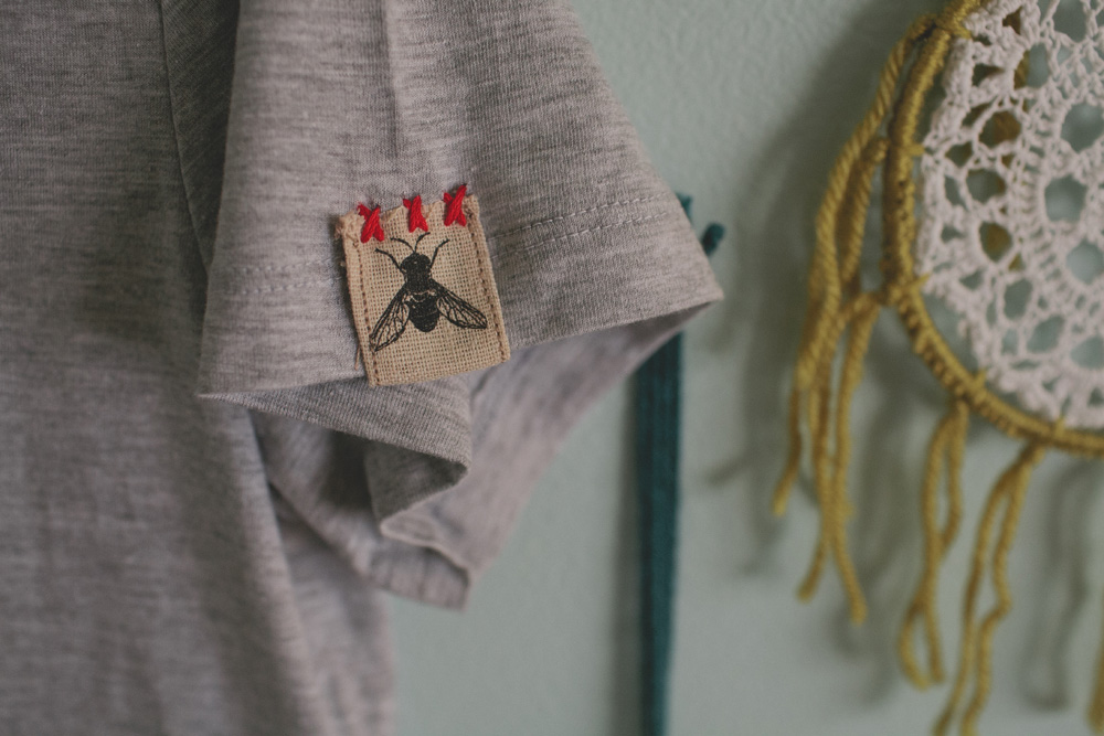
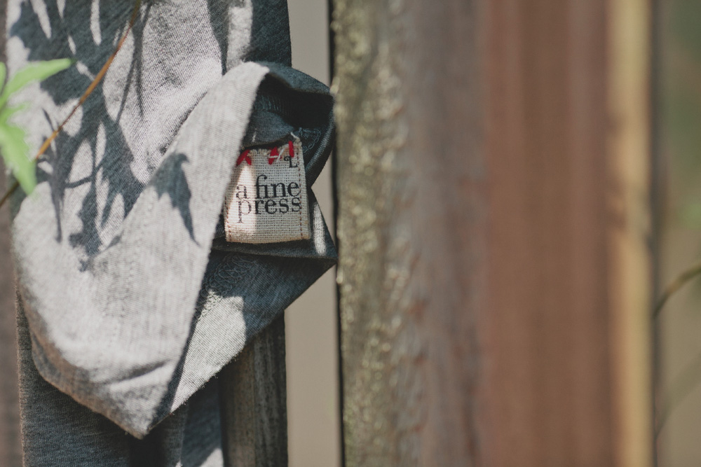
The shirts were screen printed by iNK Screenprinters in Lakeland and the tags (featuring elements of our new visual identity) were hand-stitched onto the sleeves.
If you’d like to talk to Matthew about having A Fine Press help you tell your story via branding / visual identity, you can use our contact page or call us at the number above.
looks great Matthew, love the AFP tag!
Thanks! This project moved pretty fast; excited to move on to v. 2