I remember the very first time I order business cards from Moo.com. They were their tiny little mini cards. I used a few different photos Tina Sargeant had taken of me for my career as a jazz bass player. I was so proud of those things! They were different than anything I have ever seen and I thought they were so cool. Then I had people tell me the they were frustrated that they got lost easily, that they didn’t fit in their binders or rolodexes, and that they thought I was just being weird or difficult.
Up until then, I had never really encountered business cards that didn’t fall in line with the US standard three-and-a-half by two-inch rectangle. Now that I’m in the industry, sometimes I feel like I’ve seen it all: die cuts, origami, giant, nearly microscopic…every permutation you can imagine.
Sometimes it seems like designers do this just for other designers. I hate when designers lose sight of the fact that business cards have a primary function: to serve as a proxy of the person whose name it bears. To remind the recipient who the owner is, what she does, and how to get ahold of her. Any design, no matter how clever, that impedes on this primary function is a failure in my book.
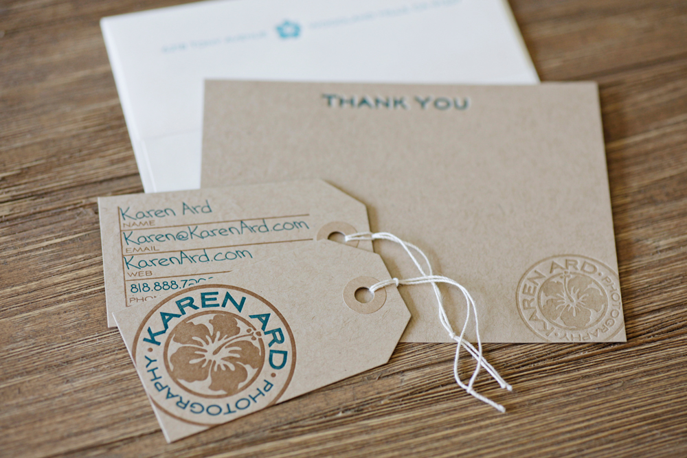
I love taking risks but I strive to make sure form always follows function. Interesting permutations on the standard business card can serve to enhance your message and not detract from it. When I helped Karen Ard develop her brand, we wanted to elicit the feel of international travel. So while we retained the standard size for her business cards, we used a diecut to clip the corners and add a hole, evoking the feel of luggage tags. This was a clever enhancement of her story that didn’t get in the way of the bearer storing it in a card case or wallet.

Karen’s kraft stationery suite (with a contrasting envelope)
The primary thing you have to consider when determining whether or not to deviate from the norm is the way your audience uses business cards. This is why I always ask clients how they will be using their cards. A card left out in stacks at a trade show booth serves a very different function than the card handed to a CEO to punctuate the end of a high-powered lunch meeting. A card included with every shipment of an order doesn’t serve the same purpose as the card you hand someone at a networking event. And a card being handed out to salesmen is being used very differently than the card being handed out to Creative Directors.
How the recipient uses business cards should be something you’re very concerned about when designing your own cards. If he will put your card in a Rolodex or binder, it needs to fit. In that case, a clever die-cut could help solidify a brand message while keeping the outside dimensions of the card to three-and-a-half by two. If, however, you’re handing out cards at a trade show, it may be worth the risk of inconvenience for a few people in order to have your card stand out in the stack of swag.
If you trust that your audience values the unusual, consider cards that serve multiple functions such as merchandise tags or postcards.
No matter what shape your business card takes, I believe that quality design and good texture are two of the best ways to increase your impact. Thick foil stamped or letterpress cards made from unconventional materials will always catch the bearer’s eye.
When you’re looking to redesign your business cards, consider breaking the constraints of the standard size. Just make sure that whatever path you choose, the design serves your message.
0 Comments