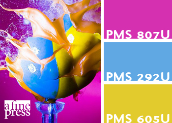
Like many of you, I’ve recently been taken by Pinterest, a social media answer to the designer’s inspiration board. Besides the excellent social aspects of it, Pinterest is great because it lets users curate multiple boards, each with its own theme. I’ve created boards of pretty food, tattoos, black and white photography, and great architecture, but one of my favorites is my color-inspiration board.
I’ve decided to take the inspiration a step further by creating a 3-color (Maybe more) palette for each post and to post them regularly to this blog. Each post will contain an image and a color palette of PANTONE Matching System colors the image inspired. Because most of the papers a fine press utilizes are uncoated, I’ll be using the PATONE solid uncoated book.
Each image will link back to my pin, where you can follow through to the original image at its source and, hopefully, find your own inspiration.
All that said, here’s the first in our series – a high-speed photo of an exploding paintball from Alan Sailer:
If you work with PANTONE colors, you’ll know that what you see on screen is often not what you get on paper, so consult a swatch book for an accurate representation of the palette.
Watch for more color inspiration here.

