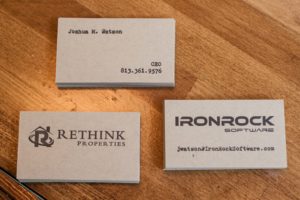
Recently, one of my neighbors at Catapult Lakeland asked for some business cards that solved a couple problems he had. Like many creatives and entrepreneurs, Joshua leads a couple different lives. He’s the CEO of a software development company and owns a real estate company, among other things. He wanted a business card solution that was relatively minimal in content, reflected a hand-crafted vibe, and funneled recipients to his most effective channels of communication.
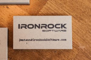
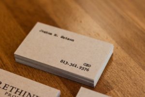
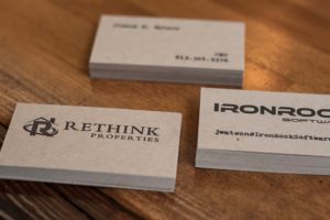
To do this, we printed two separate cards at the same time (called 2-up printing) and placed Joshua’s primary contact info – his name, title and phone number) on one side. The details were initially created on a mid-century Montgomery Ward typewriter and scanned to create letterpress printing plates. On the back of the cards, we placed Joshua’s logos (in the space between the details on the other side so that we could hit the paper pretty hard without effecting type on the other side) and added his email address for the software company’s card.
They were printed on French Paper’s Muscletone 140# Kraft paper and that makes it possible for Joshua to keep a few of each in his business card holder at all times, ready to give the right one to a prospective client.
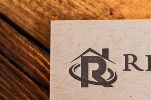
I’m particularly happy with how the halftone “R” came out in the Rethink Properties logo. It was a clean and direct solution to turn a two-color logo into a one-color print.


0 Comments