In my mind, the core of design lies at the intersection of form, function and money. It needs to solve problems. It needs to look good. It needs to work. And someone’s got to be willing to pay for it (design for a cause still involves some manner of value exchange).
Like many designers, I’m a fan of good design in all of the shapes and (ahem) forms it takes.
That’s why, despite the ridiculously manufactured drama that besets so much of the light that radiates from TVs across the country, I was pretty wrapped up in a binge watch of what I fear may be the only season of Spike’s Framework.
It’s hosted by Common (yep, that Common) and features a pair of judges I knew from their work even if I didn’t know their faces.
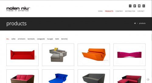
Nolen Niu
I won’t pretend to know much about the history of furniture design. To my eye, so much of Niu’s work seems like the paragon to which so many modern, hip boutiques aspire. I feel like I see so much, even in IKEA, that’s inspired by his forms without ever achieving the visual impact of Niu’s. His shapes are so bold and create such a presence.
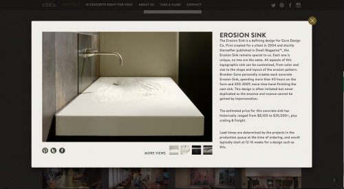
Brandon Gore
I’m sure I “discovered” Brandon Gore the same way almost every other casual enthusiast (is that such a thing?) in the world did, through his Erosion Sink, which made waves through Dwell and then hit virtually every design blog in existence. He’s been a deep well of inspiration and even stirred me to experiment with concrete (I need to do some more of that).
What I found most interesting about the show was the emphasis on function. The dynamic was interesting. Common’s role was clearly that of the proxy consumer. A novice with little basis for critique beyond his own taste. What was interesting was that his hunches about comfort were often confirmed when Gore brought out the measuring tape. It’s funny to me – “bench height is x inches.” “a coffee table should be between x and y inches.” It’s codified and we’re conditioned to find these measurements comfortable and things outside of that just don’t feel right.
It was also a great lesson in editing. Every cool mechanism or armature became a potential failure unless it was designed and executed flawlessly. Does the cool stuff actually make the piece better at its intended use?
All of this applies to stationery and wedding invitations especially. There are common shapes and sizes for invitations (and business cards and letterheads…) for a reason. Some have to do with postage. Some have to do with how they’re stored or handled. Some are practical. Envelope makers don’t carry every possible permutation of paper, color and shape. They carry what sells.
The cool thing is: there are plenty of times to flex some out-of-the-box muscle and use non-standard materials or non-standard shapes and sizes. The most effective way to do that is by knowing why the standard is standard. As a stationer, knowing these things allows me to help guide clients toward the highest impact ways to do what an invitation is supposed to do: announce your event, give guests all the necessary information and collect information about who will be attending. Anything that prevents an invitation from doing that is bad design.
It was worth the drama (though I’d rather shows leave that to crap like Dance Moms) to see these incredible designers work through their processes and then be forced to look at their pieces through the critical lense of function. I think a lot of graphic artists, especially early in their careers, forget that making pretty things that don’t solve problems isn’t design. It may be art, but it’s not design. (tweet this)
0 Comments