
I recently wrote about the problem with tearing paper – well, specifically when you’re tearing paper to mimic the natural, deckled edge of a handmade sheet.
But sometimes you just have to tear some paper.
One of the things I’ve encountered often on my journey is designs that work well on a screen that have very serious challenges when it comes to existing IRL.
Effects and floods of color and layers that render in perfect 4K resolution just don’t translate.
But when I started working with Chase Wagner and his team at Grace City Music on a promotional piece for their new album, I took this great promotional image as a challenge:
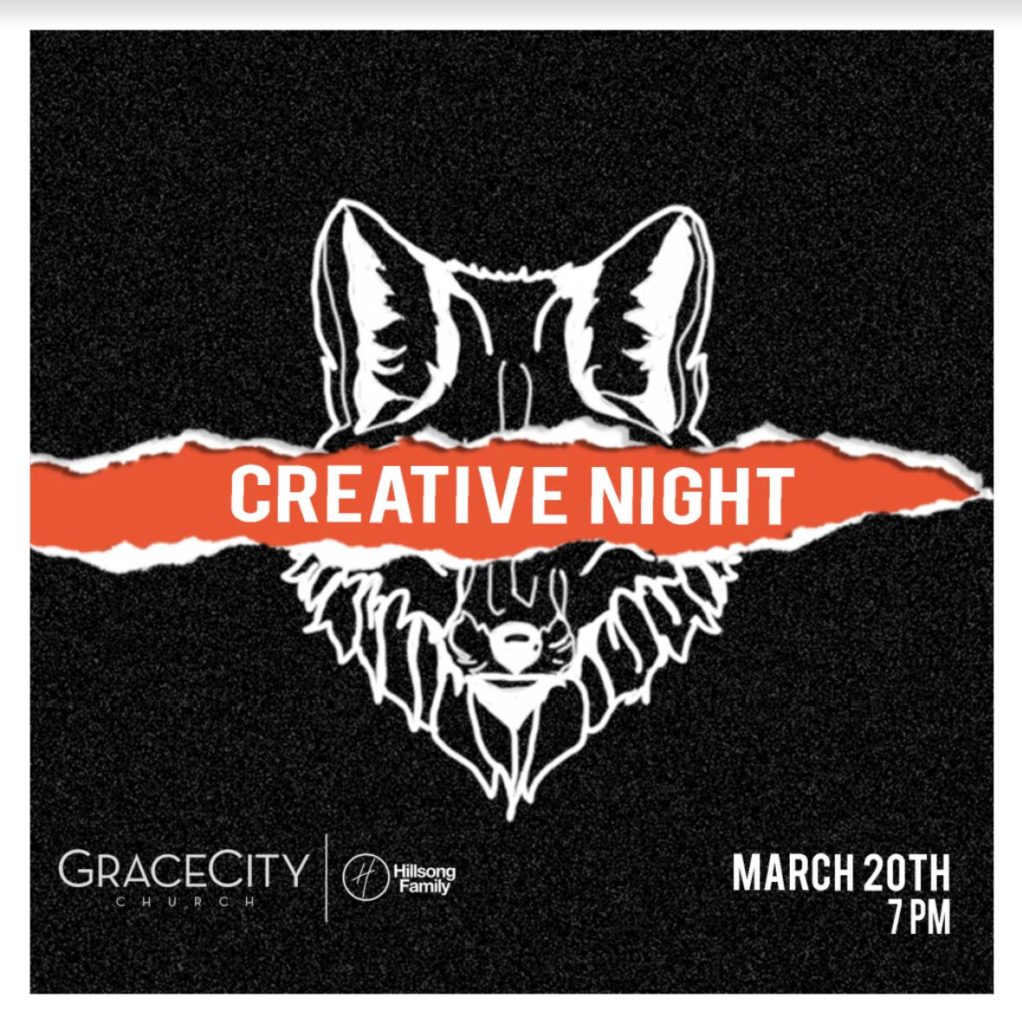
How could we incorporate this striking layout into a printed piece?
Like most projects I undertake, I know it was possible, but not entirely sure how. The logistics of partial glue-ups and trimming uneven layers of paper make for a printer’s nightmares.
Luckily, I thrive on the chaos.
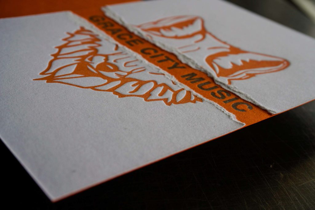
I landed on a process based on my go-to low-quantity duplex method: gluing up with Super77 spray adhesive. The challenge was how to create an area where the front sheet could be torn away and the sheet behind it exposed, free of glue.
The solution was fairly simple – a strip of very thin torn paper provided a mask for the glue, preventing adhesion and giving us an area to tear away without residue.
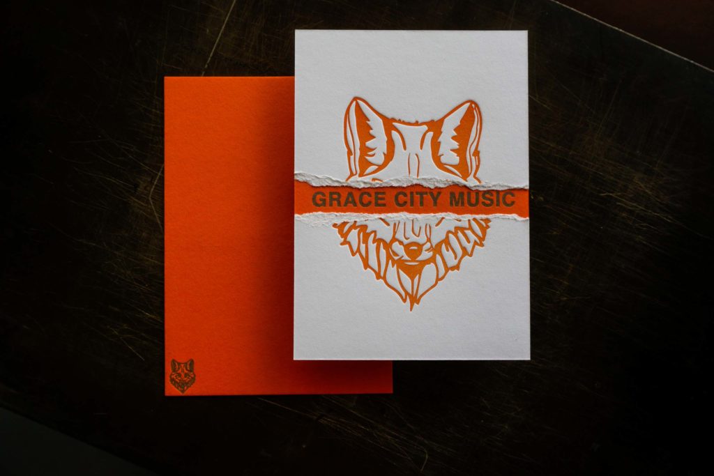
I’m incredibly happy with how this came to be – it looks pretty much exactly like the vision I had from the onset – but more important is the impact we can create with a piece like this.
If the goal is to be noticed and remembered, I have to make noticeable and memorable stationery.
I think the key to being noticed – to creating a true mailbox moment – comes from fresh vision. It’s unusual methods or materials or execution. It’s stationery so thick it has to be shipped in a box or an execution normally saved for one domain (digital design) applied to another (print).
Being remembered is something else. It’s about creating something that feels like a gift to the recipient. I normally eschew the use of logos in the quest, but music (and fashion) are very different worlds where the logo is a badge of honor. So we worked on creating just the kind of notecard that you’d not only want to keep, but proudly display.
What do you think? Did we do it?
0 Comments