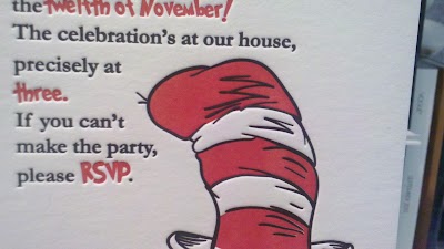
You may have noticed that a significant portion of the work being produced by a fine press is produced by letterpress, a method of printing where a raised surface, coated in ink, is applied to paper to create an image. From Gutenberg through the first half of the last century, this was the most common form of printing. It’s since been replaced technologies that lower cost and increase efficiency.
Then a new argument was born
See, if you talk to an old-timer, you’ll hear the term “kiss impression” used when talking about this method. It basically means the forme (there’s that funky spelling again) barely touches the paper, leaving ink, but no impression. That’s not quite what we’re used to seeing today, huh? I know where the printers stand; they’re pretty neatly divided into the kissers and the smackers. You can read all sorts of entertaining discourse between the newbs and the old-timers here and here.
Frankly, what I’m interested in is what the client wants. So graphic designers, brides, wedding planners, business people; please tell me: what’s your take? Do you like that deep impression? How deep is too deep?


I’m a huge admirer of letterpress – and when I think of the look of it, I don’t think “kiss.” It’s the dimension, the texture, the feel that’s unlike screenprinting, flexo or offset. Nothing offers such a beautiful treatment to paper as letterpress. Albeit, I’m from the old school, where we used rapidiograph pens to make logos, amberlith for color separations, and I can’t imagine paying for letterpress without the impression.
I’ll have to show you one in person and see what you think. I love the front, but really am struggling with the tradeoff.
these are adorable!!
Yours should get there in a day or two.
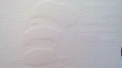
I love a deep impression but I’m not a fan of the show-through on the back. If I’m asking my printer to go deep, I make sure the paper is thick enough to handle it well.
Kelli – That’s pretty much the way I feel. There’s only so much compression you can eek out, no matter how hard the packing.
What are your brides saying?
You pointed roughly finicky subject matter. These tips are very beneficial.
My travel blog Top Travel Destinations.