State of the Art is our not-so-regular series where we highlight the work of those in our industry who knock our socks off. We are proud to be part of such a vibrant, creative industry and strive to create work as excellent as that which we highlight here.
This week, we’re highlighting color in letterpress. Of course, we’re starting with our favorite color: blue! It’s great how letterpress translates so well for modern and classic designs. Here are a few of our favorites (click on the photos for credits. Remember: this is not our work, it’s work we love!):
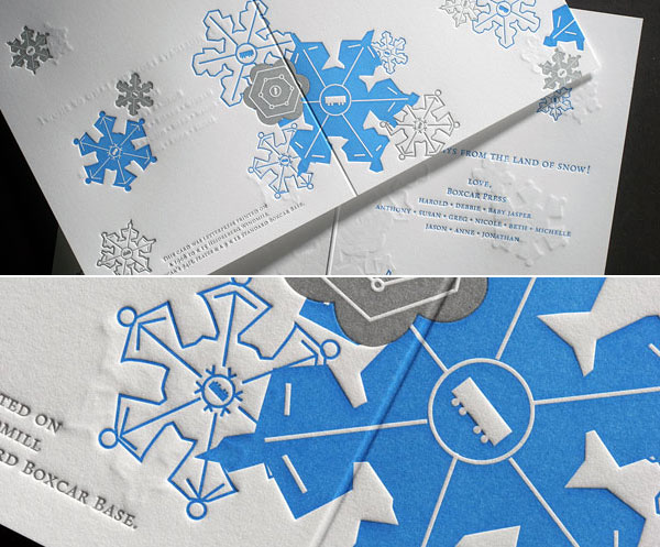
This holiday card from Boxcar Press is amazing! I am a little hot and cold on the depth of the impression here, a completely intentional look, where the snowflakes show through on both sides of the card. This particular shade of blue is pretty killer, too!
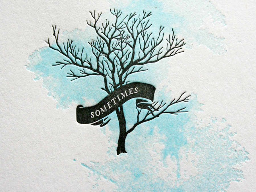
I really dig the half tones on this one from Studio On Fire. It’s the CD packaging for Erik Brandt‘s album Sometimes.
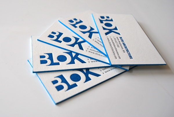
These ultra-modern, extremely thick business cards from designer Nicole Kraieski would be cherry even before the matching painted edges!
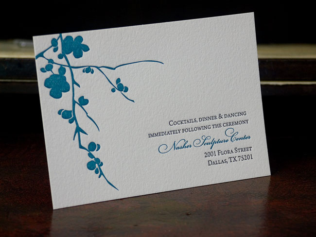
I really dig the single-color representation of a flowering branch on this reception card by JazyRain.
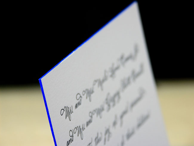
So, they’re not printed blue, but the electricity emanating from the edges of this piece (again, from JazyRain) is enough to get me excited.
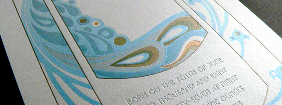
I’m an absolute sucker for this Art Nouveau baby announcement made by Mandate Press for the birth of their own child, Eden. More photos can be seen on their flickr page.
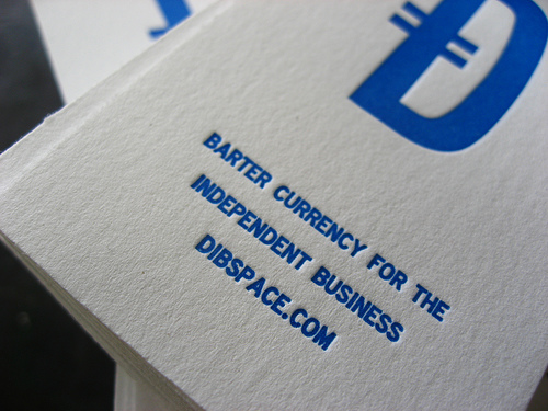
Lastly, here’s my favorite shade of blue from Miss Cline Press.
Now, your turn. Share your favorite blue letterpress piece in the comments.
0 Comments