It hasn’t even been 24 hours and the western world is already drawing battle lines.
Are you team #BlackAndBlue or team #GoldAndWhite?
My own house is divided, with me firmly in the #BlackAndBlue camp while my wife has seen it both ways. It’s kind of crazy. And really stinking cool.
I think a lesson to take from this is that lighting can strongly affect the perception of color. Nowhere is this more apparent to me than in the countless photos exchanged between a couple and their wedding vendors while planning for a wedding. Did you know that the dress that started it all was an MOB’s dress!
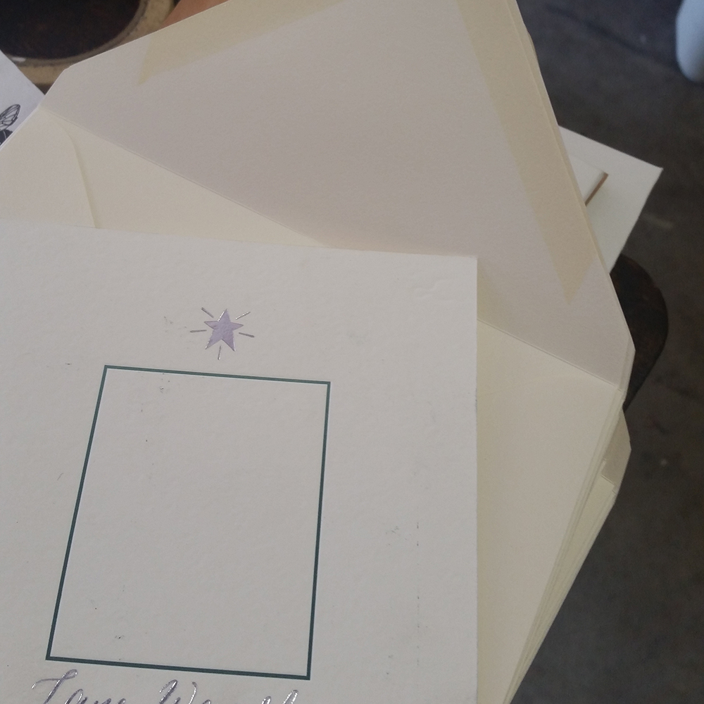
It would be great to see every wedding-related sample in person, but that’s not always feasible. In that case, I find the next best option is to include a frame of reference in the photo. In this case, a previously printed sample that the client had a copy of helped her better determine the “whiteness” (or “creaminess”) of this particular envelope.
This is something I try to put into practice whenever I’m drawing attention to color in photos. While not the same as seeing it in person, including a color reference (in the same light as the subject) can help minimize confusion.
Do you have any tips or tricks to help prevent your own version of #TheDress?

0 Comments