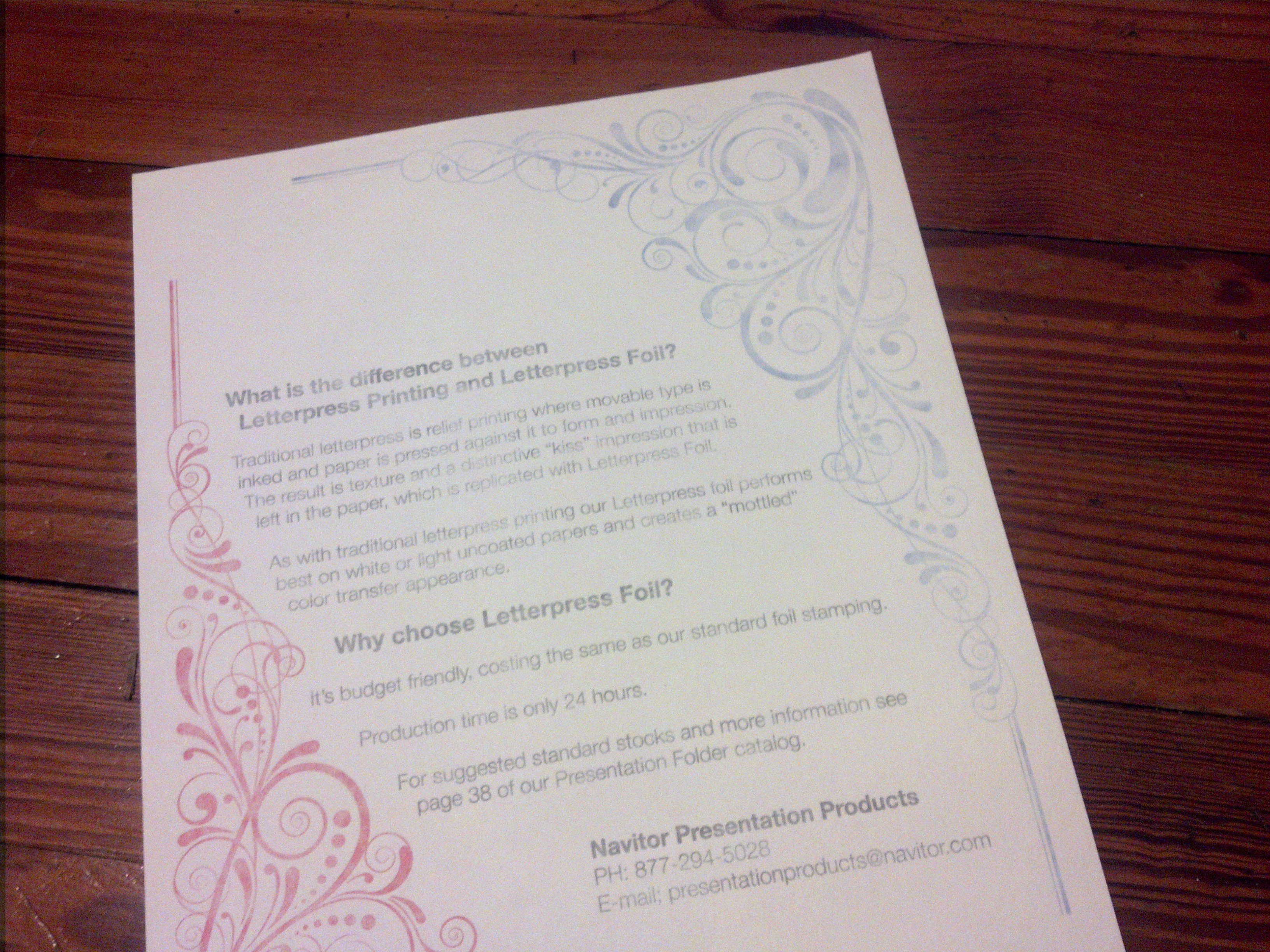
I received this in the mail this week. It’s from a company that does presentation materials: folders, packaging etc…
I’m usually content to let other people do their thing, but I couldn’t sit by on this one. From the obnoxious marketing speak to the un-educating of people interested in this art form, I think this piece does some level of harm to the state of the art.
- That “kiss” impression to which it refers was (is) actually no impression at all. It’s not what clients want these days, but it’s the sign of a good pressman. Lead type can’t stand up to being bashed into paper constantly. The whole forme (yep, it’s spelled that way) inked and printed with little to no impression on the paper.
- What in the world is “Letterpress Foil?” Most foil stamping you see is done on the same presses as letterpress printing. There’s the addition of heat and a roll of foil that leaves all that shiny goodness (and it can be good) in the impression. So, best I can tell, there’s no difference between letterpress printing and “letterpress foil.”
- Here’s the most egregious offense: They’re trying to pass of this horrible print job as the hallmark “mottled effect” of letterpress. This is not only sloppy and lazy, but downright deceitful. See all that banding of dark and light in the blue figure in the top right? I get that effect sometimes. Then I throw those sheets away and fix the problem.
Letterpress, especially when printed on a hand-fed platen press, is not a perfect, consistent way of reproducing designs. There can be small inconsistencies in ink color or minor variances in register. If they’re within reason, these do become some of the hallmarks of letterpress and some clients consider that desirable.
This, on the other hand, is a shame. I’ll bet most printers could turn that poor quality of work around in 24 hours. Please, don’t let a piece like this allow you to believe that letterpress printing is the commodity it once was. This is an art that many people have toiled and sacrificed to advance. It takes time and is not inexpensive.
Here, I’m reminded of the Iron Triangle.
Fast, Good, Cheap. You can only pick two.

0 Comments