Contrast.
It’s a fascinating, powerful tool.
When disparate things are brought together thoughtfully, the whole is often greater than the sum of its parts.
That’s the effect I wanted to achieve
with these concrete invitations.
The natural meets the man-made.
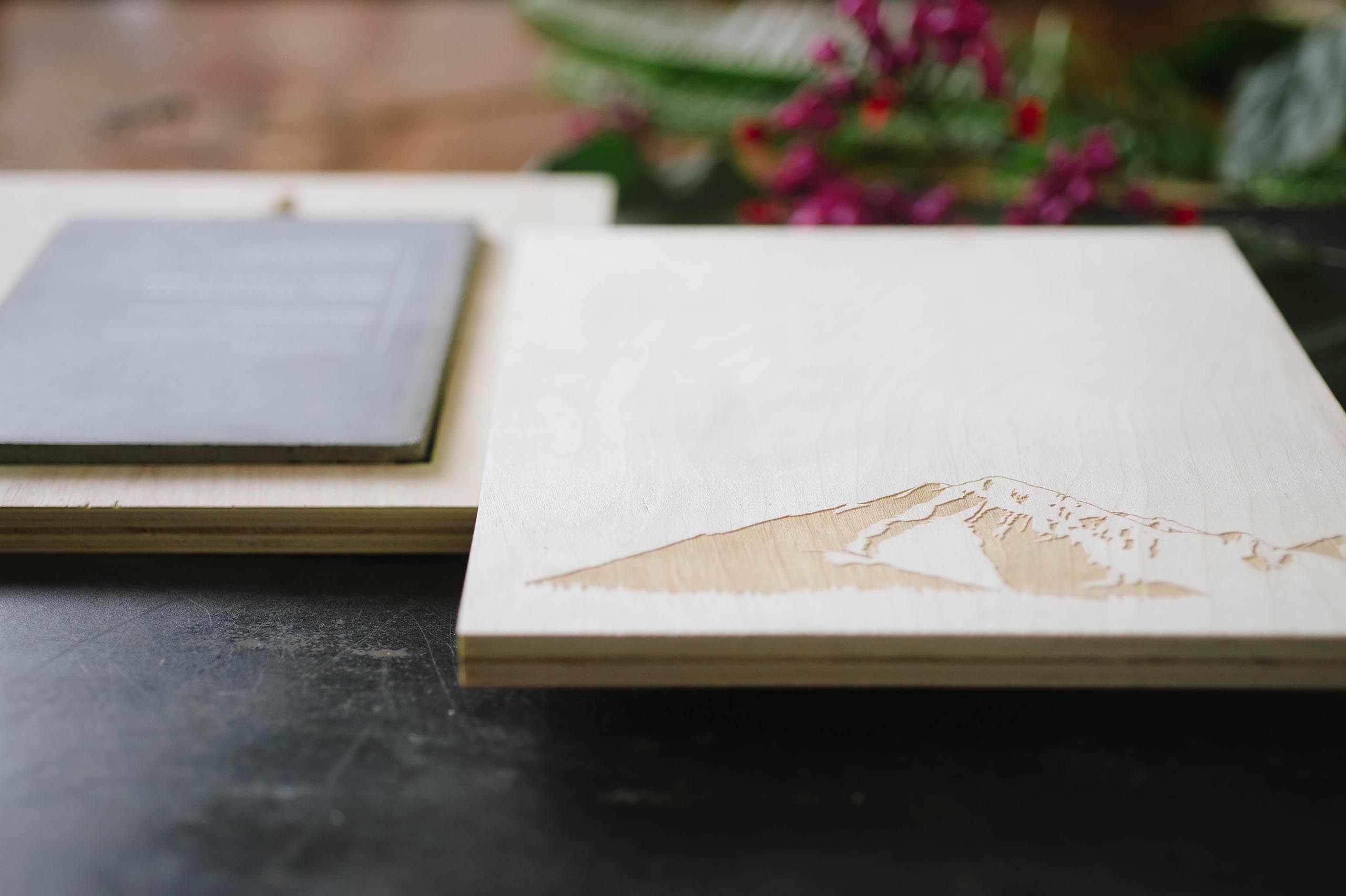
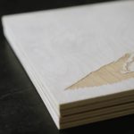
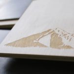
Wood, removed from its natural state and processed – sawed, compressed, burnt with lasers – to make something stark and wonderful.
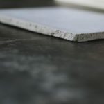
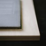
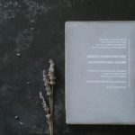
Concrete – mixed from a variety of materials into a cool, stately grey sheet; it retains some sense of process as its edges wear.
Like so much of the architecture and art that I love – it’s modern, industrial and cool. I wanted to make an invitation that married the work of machines and hand and made both evident in the process.
A Modern Denver Wedding
How do you do a Colorado wedding that incorporates wood without going rustic?
Mountains and plywood, of course!
It actually started with the silhouette of a mountain – an ode to a skyline no man could ever make. We wanted to use it throughout the suite – as a reminder of place and time.
Concrete –
both as a modern, industrial material and a product of the rocky earth around the big day – was the perfect material.
We went through multiple iterations to find a strong, stiff concrete that wouldn’t crack without sheet or bar reinforcement. It had to be cast thin enough to allude to a “normal” paper invitation. The details were printed in a minimal white layout on the front.
Something they won’t throw away
Let’s be real.
Your guests love you and are thrilled to celebrate your big day with you.
But they don’t need tchochkes emblazoned with your names or anniversary strewn about the house.
But give them something useful – give them art – and they can cherish it for its own beauty and it will remind them of the joy of your big day.
So we used the mountain.
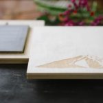
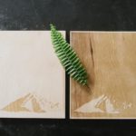
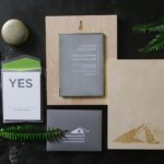
In white on the back of the invitation and as a diptych of laser-engraved wood posters. In positive and reverse, guests can display the pair together or separately. We made keyholes for hanging or they can be placed on a shelf.
Dual Purpose
The wood posters also served to protect the invitation during shipping. Cavities carved in the back of each nestled the invitation safely for transport.
Two RSVPs
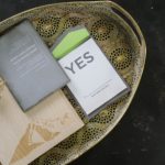
In keeping with a minimal aesthetic, we gave each response (“yes” or “no”) its own RSVP card. Bold and clean.
It’s my favorite project to-date.
A Fine Press does its best work when we’re able to dream big and this one was big.
Are you ready to dream big with us?


0 Comments